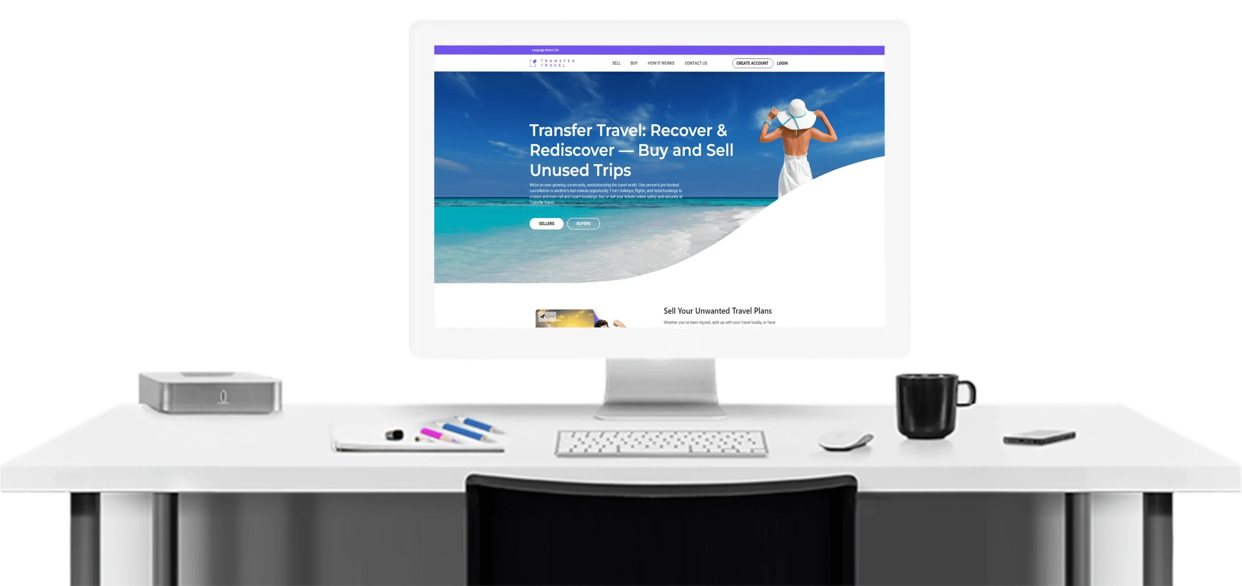
About Transfer Travel
Transfer Travel is a unique platform where users can sell their bookings of events, accommodation, travel, and more to potential buyers. People often find last-minute cancellations turning into a total loss, and various platforms do not offer refunds. Transfer Travel allows you to sell your bookings to other potential buyers to resolve these issues. People selling their bookings need to edit the name on the tickets or other booking forms to ensure a hassle-free transfer to the buyers.
Transfer Travel recognised that their site was too simplistic with a user journey that was difficult to use and bugs that needed fixing. They approached chilliapple to gain recommendation on how to enhance their website and user experience and fix all such issues.
Technologies Used
Their existing website uses Angular JS version 6.2 in the front end and the Laravel framework 5.5.50 in the backend. We made necessary changes in the front end and the back end of the code to ensure smooth performance and high user experiences for the buyers and sellers on the website.

Services we offered
We upgraded the existing website with new functional features, pages, and resolved issues related to UX. The pages were added to ensure buyers and sellers can easily manage transactions and bugs were eliminated from the existing website code.
-
Resolved Bugs
We conducted quality assurance testing on the Transfer Travel website to properly identify bugs and remove them from the application code. Our experts checked the website for 50 man hours to ensure all the bugs were determined for necessary actions.
-
Added New Pages and Sections
As per the client’s needs, several new features were added to the website, including ‘create my listing’ and ‘checkout’ pages. The website code was equipped with voucher code and new registration pages, enhanced email confirmations and the success page.
-
UX Enhancements
Changes were made to the website navigation capabilities to ensure a hassle-free experience for both buyers and sellers. The checkout page was optimised and added 20 currencies to enable users to make smooth transactions.
Got a project you'd like to discuss

Our Process
The project requirements were distinct and clear. They wanted us to identify all the bugs on the website code and get rid of them. The client complained of poor UX of the website and this was affecting engagements. Several changes were necessary to ensure smooth navigation and high UX.

Requirements
Transfer Travel agency realised that their existing website suffered from a poor user journey. The website needed changes to ensure a more engaging UX. Additionally, their website contained several bugs that affected its performance and usability. They wanted us to identify all the issues with the website and make necessary changes in the navigation to ensure a greater UX. We spent 50 hours quality assurance testing the Transfer Travel site to recommend website enhancements. We systematically addressed the existing bug issues and developed various functionality improvements to both the seller and buyer experience.

Solutions
We reconfigured the listings to enable multiple currencies as well as a new seller listing system and user flow. We developed a payment facility to charge sellers for their listings, the charge of which is dependent on the listing price threshold. We also built a new section on the ‘create my listing’ and ‘checkout’ pages for sellers to add a discount code to their listing. The voucher code was a new functionality created at the front and back end to increase the incentive to create more listings and, therefore, more sales. We also built new registration pages, enhanced email confirmations, and a success page.

Results
The integration of the new pages helped to ensure simple and smooth navigation for both the buyers and sellers using the website. The site now has a seamless user journey and payment functionality for seller listings. Sellers can easily navigate and upload their listings. Buyers can browse listing options and filter their searches. Twenty rather than three currencies are available to choose from, and the checkout process is quicker and easier to follow. The integration of multiple currencies onto the website allows for the smooth exchange of bookings for both buyers and sellers.

