Boost Mobile Commerce with Effective Product Pages

18 October 2024
Gearing up for Black Friday sales, ensure your eCommerce site can handle a surge in mobile traffic. Surprisingly, in 2023, 79% of Black Friday online store traffic were customers using mobile devices!
This is why you need mobile-optimised product pages that engage customers and drive sales.
In this blog post, we’ll explore why launching mobile-friendly product pages is essential.
What is the importance of mobile commerce?
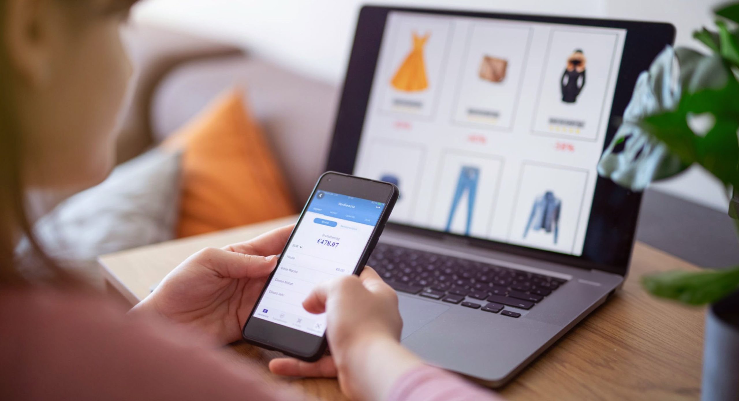
Consumers primarily rely on their mobile devices to shop online. Worldwide mobile traffic dominates eCommerce, with a share of 78% compared to desktops and tablets. If your product pages aren’t mobile-friendly, you are bound to lose a great share of potential customers and sales.
What do you do when you struggle to navigate, zoom, or interact with any website? You are more likely to leave the website and search for an alternative!
Customers who feel frustrated while trying to make a purchase are more likely to abandon their carts. Mobile-optimised product pages means customers can easily browse, select, and buy items effortlessly.
Industry leaders like ASOS and John Lewis have launched mobile shopping experiences. Their mobile-friendly layouts feature distinct images, simple navigation, and quick checkout options. This means they allow customers to browse seamlessly and complete purchases with minimal clicks and page-transitions.
Here are 7 tips to prepare your business for mobile commerce
To prepare your product pages for the mobile shopping surge this Black Friday, follow these essential optimisation tips:
1. Test on various screen sizes
Ensure your product pages are screen-responsive. This means they load and interact seamlessly across different mobile devices and screen sizes. Analyse the following:
- How quickly the images are visible to the users
- The ease of interactions
- Key product information, such as price, description, and customer reviews, is easily accessible to users.
This step is crucial to identify any areas that may require adjustments.
2.Simplify your page layout
A cluttered product page overwhelms users and increases the bounce rates. A simple, appealing layout free of irrelevant content builds a neat shopping experience. Highlight essential information like item details and price and remove distractions from the product pages.
3.Optimise image sizes
Large images can slow down your page and increase the load time. This is detrimental to mobile users. Compress images without sacrificing quality to enhance page speed. Fast-loading pages are vital for retaining users, as delays turn away potential buyers. A web development agency can make your page loading time less than 3 seconds, which is necessary for good UX.
4.Add attractive and easy-to-tap buttons
Ensure buttons are large enough and easy to tap with fingers. CTA buttons like Add to Cart/Buy Now, must be prominently displayed and sized appropriately. Try to build a hassle-free interactions for customers.
5.Streamline the checkout process
A complicated or poor checkout experience can affect your business’s sales and return on investment. Mitigate this risk with a straightforward mobile checkout experience that has minimal steps. Enable guest checkouts and do not force customers to sign up or build an account.
6.Include customer reviews
Customer reviews play a significant role in the purchasing decision. Make sure these are readily available on your mobile product pages. Genuine reviews help build trust and encourage potential buyers to complete their purchases.
7.Utilise mobile-specific features
Leverage device in-built features like geo-location, voice-recognition, etc., for building an all-inclusive eCommerce website. These elements can enhance the shopping experience efficiently.
Conclusion
Optimising your product pages is a necessity in the eCommerce landscape, especially during high-traffic events like Black Friday. It helps you enhance customer satisfaction and increase conversion rates.


